PoTTSVILLE BEACH CRICKET CLUB
a design exploration
Building on the success of our first round of apparel with the Pottsville Beach Cricket Club, we looked at ways of integrating more club related imagery such as feather graphics or a more refined kaleidoscope pattern. As well as focusing more on the club colours of Black, White and Purple. This process begins with the design of a new logo
A variety of logo concepts
The Final Logo of the process
The design process began by analyzing the original logo (top right), it was decided the cartoon like pelican didn’t represent the club and its serious approach to winning. It was also decided that the logo should be self contained so it can be scaled up to be put on a gazebo type structure or a wall in the clubhouse. From there different shapes were considered, circles, shields and wave like strokes. Eventually shields were chosen as they created a visual and mental bridge between the club logo and that of the state and national logos. The pelican from the originally proposed logo (top left) was then chosen as the mascot on the logo, this is backed by the sprawling wings of a bird about to take flight, signifying the upwards trajectory of the club. This was all sat behind a purple cricket ball, again creating a visual symmetry to the state and national logos.
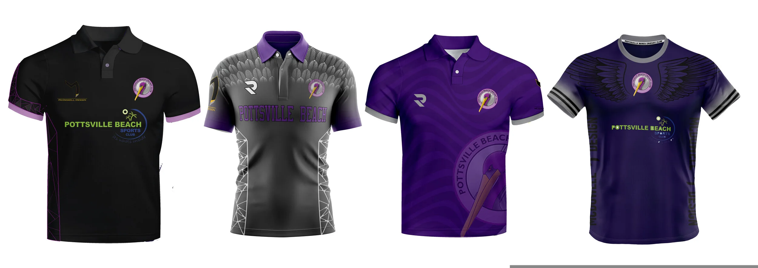
For the apparel we began the refresh by analyzing the outgoing styles.
While the original designs were a success they left a little to be desired in terms of graphical impact, so the challenge began on how to create clean yet dynamic set of designs.
To begin there was a desire to keep the kaleidoscope pattern in order to create a visual bridge between the new styles and the old.
The feather pattern found on the grey training shirt was translated across to the playing shirt and club hoodie in V2
An alternative approach for V3 looked at more reserved, minimalist and abstract versions of the patterns, along with the introduction of a purple kit,
A decision for V4 was made to cement the colours with white representing the traditional longer format game and the purple representing the shorter format, with the training gear returning to its original grey design.
For V5 the patterns were reversed with the long format design now featuring the feather graphic and the short format using the kaleidoscope pattern. However this design opened up an opportunity to reintroduce the dual colour tones seen on the original garments. The training shirt is presented in a contrasting purple.
For V6 the black was returned to the community polo, portraying a professional outfit. with the purple being adopted as the primary colour for the club. With evolved wing graphics there is a clear visual connection between the two with the playing gear looking like a more evolved and refined version of the community polo. The training shirt also benefited from a more striking design. featuring a pelican in front of a wavy background.
A RETHINK OF THE COLOURS
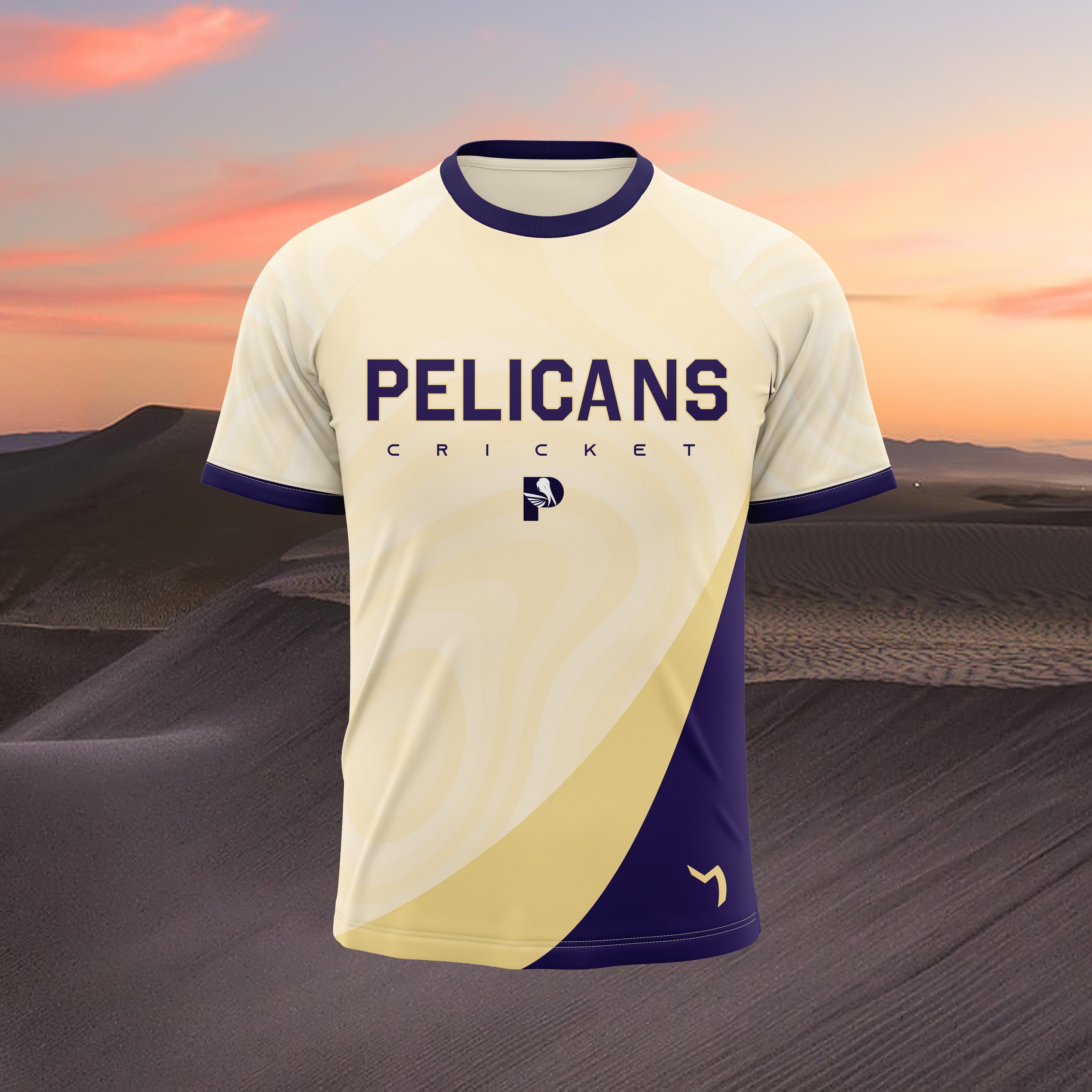
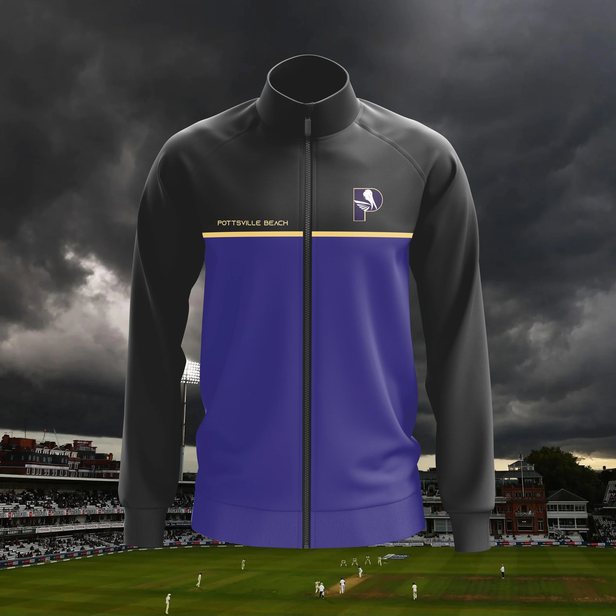
Upon further reflection the implementation of the “Sand” colour was decided upon as it reflects the beach centric culture of the town. It also provides a high contrast colour to the dark royal purple, charcoal and black. A secondary logo was added as well
The Final Outcome


